When a rebrand backfires


A rebrand often feels like the most visible act of brand leadership. A new name. A new logo. A clear break from the past. Internally, it provides direction. Externally, it is meant to signal where the brand is heading.
Precisely for that reason, it is one of the most risky decisions an organisation can make.
When you change a brand, you are not just changing form. You are affecting structure, recognition and protection. And that is exactly where things often go wrong.
Recognition is not a detail.
When Jaguar launched its rebrand in 2024, the iconic leaping cat disappeared. The campaign positioned the brand as forward-thinking and different, but at the same time abandoned its recognisable anchors. The reaction was severe. Sales declined. The CEO stepped down. The marketing agency was replaced. A brand with a century of heritage was derailed by its own doing.

Tropicana made a similar mistake. The iconic orange with a straw disappeared from the packaging and was replaced by a minimalist design. More modern, but also interchangeable. Consumers no longer recognised the product. The impact was immediate. Within weeks, the brand reportedly lost €27 million in revenue. Within two months, the rebrand was reversed.

Country store Cracker Barrel replaced its iconic figure in 2025 with a minimalist logo, which led to immediate backlash and a swift return to the original logo.

What these examples show is simple. Recognition is not an aesthetic detail. It is a sales mechanism. Remove your visual or verbal anchors, and you disappear from the consumer’s mind.
Where things tend to go wrong
Rebrands rarely fail because they are badly designed. They fail because aesthetic logic is confused with strategic logic.
A brand does not exist internally, but in the mind of the customer. What is built there over years is not form, but meaning. That meaning does not only reside in a logo or colour, but in the coherence of the entire brand.
Once a rebrand starts from form instead of structure, fractures emerge. The brand loses its place within the brand portfolio, its role becomes less clear and built-up recognition disappears. What looks like a visual exercise is, in reality, a structural decision.
Stability as a strategic advantage
"The strongest brands are the most boring brands."
— Thierry Cattoir, founder of Remarkable Europe
Stability is exactly what makes brands valuable. Year after year, you build meaning. That feeling, attached to name, logo and colour, is economic capital.
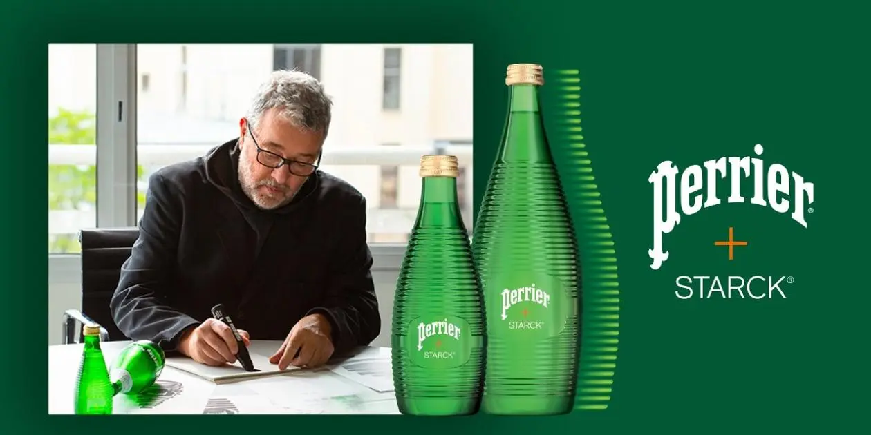
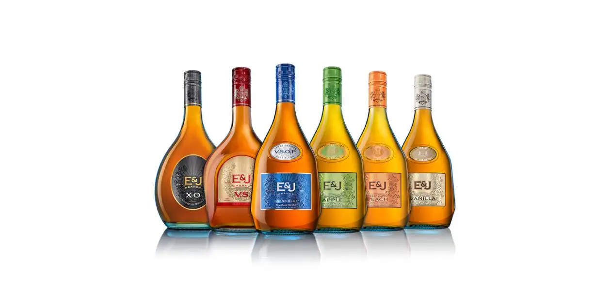
Walkers recently introduced its largest logo change in decades, evolving towards a more abstract symbol without letting go of its recognisable visual foundations.

Protection follows recognition
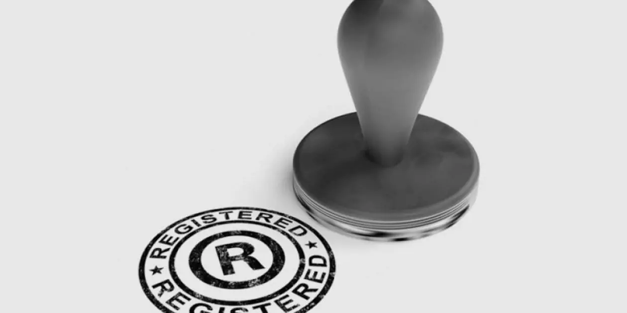
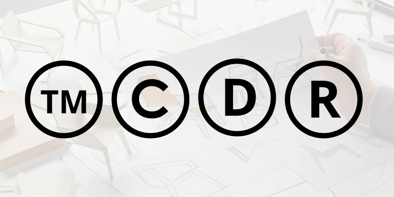
What is often underestimated is that recognition is not only commercial, but also legal capital. Strong brands build distinctiveness over time. That distinctiveness forms the basis for protection.
When visual or verbal anchors disappear, not only does recognition weaken, but so does protectability. New elements need to be rebuilt and defended, often in a complex international landscape.
In that sense, a rebrand is never neutral. It has a direct impact on the strength of the brand portfolio.
Evolution instead of disruption
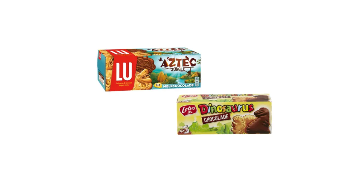
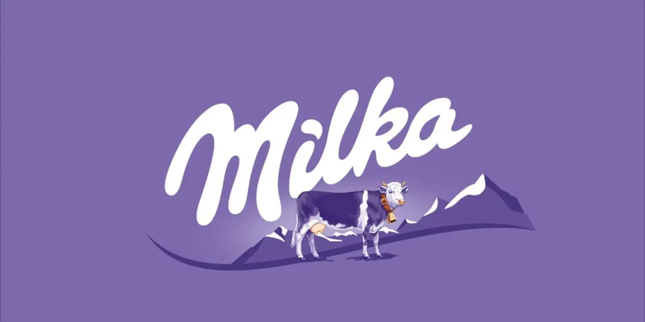
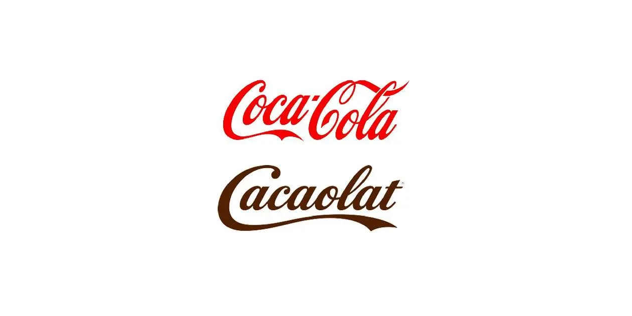
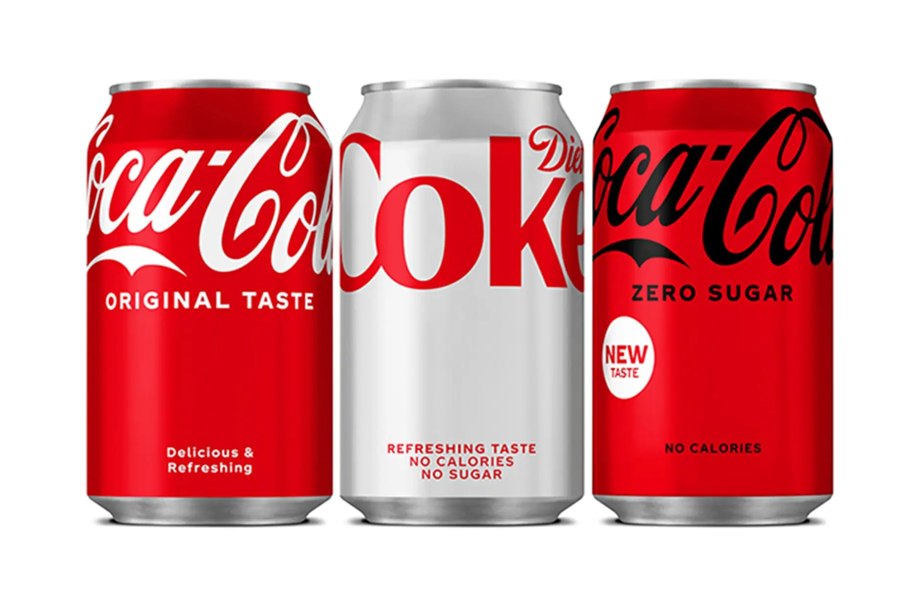
Not every rebrand fails. But successful examples follow a different pattern. Brands such as Coca-Cola, Lotus Biscoff and Samsonite evolve without letting go of their core.
They refine, reposition and internationalise, while maintaining what drives recognition. Recent updates, such as that of Walkers, show how delicate this exercise is. No radical break, but a shift within existing anchors.
The question is not "whether it is better".
The question is "whether it remains recognisable".
And that is exactly where the difference lies.
Strong rebrands build on what already exists. They do not start from scratch.
Three principles for a rebrand that works
- Know your brand equity. Protect what carries meaning.
- Evolve, don’t replace. Build on what exists.
- Rebrand from strategy, not from impatience.
The question every leader should ask before a rebrand
“What do we lose if we change this?”
That answer determines everything.
Because changing a brand is one thing.
Doing it right is another.
At Remarkable, we guide rebrands that are stragically, visually and legally protected.


.webp)


.webp)
.webp)