The challenge
Samsonite sought to refresh its emblem from 1965 to add depth recognisability, and functionality while preserving the brand’s heritage. The well-known trademark did not convey to the story and was separate from the brand itself. The aim was a modernised, recognisable logo that stayed true to the brand’s roots.
Our solution
We integrated the iconic ‘bagel’ symbol into the brand name, replacing the letter ‘o’, creating a cohesive logotype that preserved brand heritage, improved recognition, and was scalable and cost-effective for implementation globally.
Services
- Brand consultation
- Logo redesign
- Creative direction
- Strategic implementation
Refreshing an iconic logo for global impact
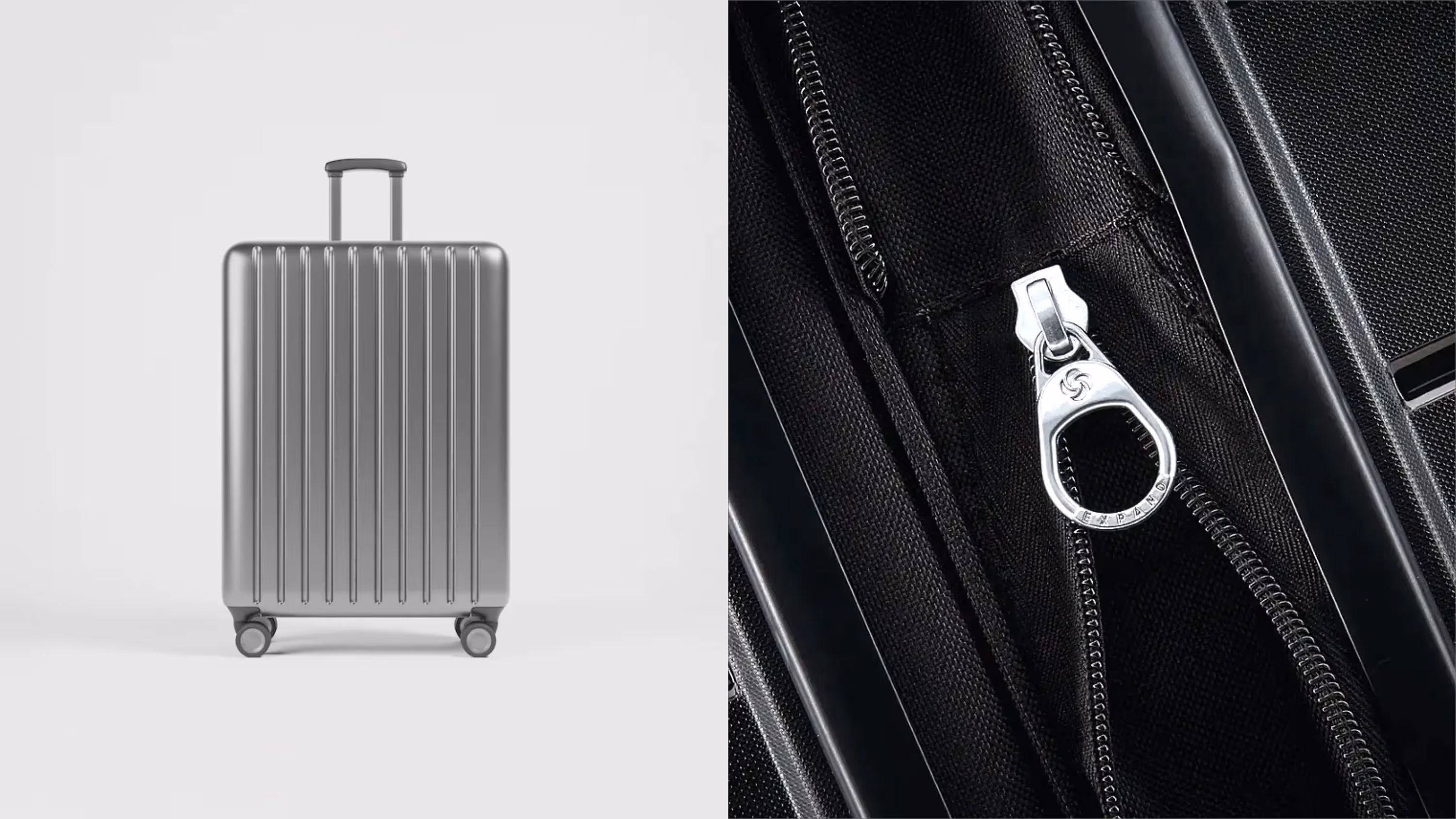
To meet Samsonite’s need for a modern, functional logo, we began by evaluating the existing ‘bagel’ emblem, which consisted of four crescents representing the brand values. Historically, this symbol was positioned to the left of the brand name but lacked a clear connection to Samsonite’s story. Our goal was to reestablish the significance of this emblem while ensuring it contributed to a streamlined and recognisable brand identity.
Incorporating brand heritage
Through multiple consultation sessions with Samsonite, we explored a range of creative options. One key idea stood out—integrating the ‘bagel’ symbol directly into the brand name as the letter ‘o’. This strategic design preserved the heritage of Samsonite while creating a cost-effective and scalable solution, improving the logo’s applicability across products, retail spaces, and corporate assets.
‘For Samsonite, we helped give new meaning to the iconic 'bagel' emblem.’
Louis-Philip Cattoir, IP & Brand Strategist, Remarkable

Result
The renewed Samsonite logo effectively conveys the brand’s story, strengthens global brand recognition, and generates significant cost savings in production and implementation. The creative integration of the emblem into the brand name ensures that Samsonite’s visual identity will remain powerful and efficient for decades to come.
Let's talk