The power of the three Brand Foundations
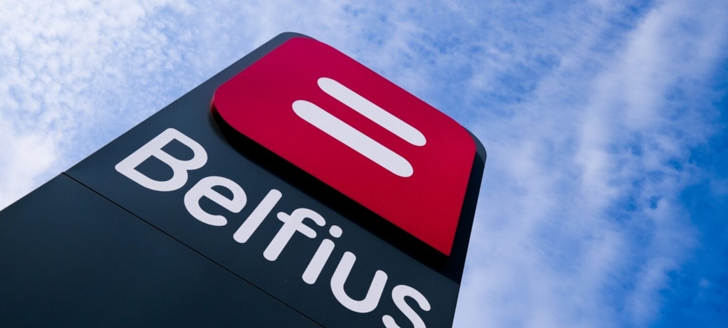

A brand rests on three foundations: name, logo and communication. Most companies treat them as interchangeable and reach for whichever foundation is closest at hand the moment dissatisfaction sets in. That is an expensive mistake, literally. Dexia gave up its name to escape a crisis and became the successful Belfius. Gap, the largest specialty clothing retailer in the US, spent an estimated 100 million dollars on a new logo and reversed course within seven days. The difference between the two does not lie in courage or budget, but in the question of which foundation actually carried the problem. Get that wrong, and you pay the highest price for the wrong problem.
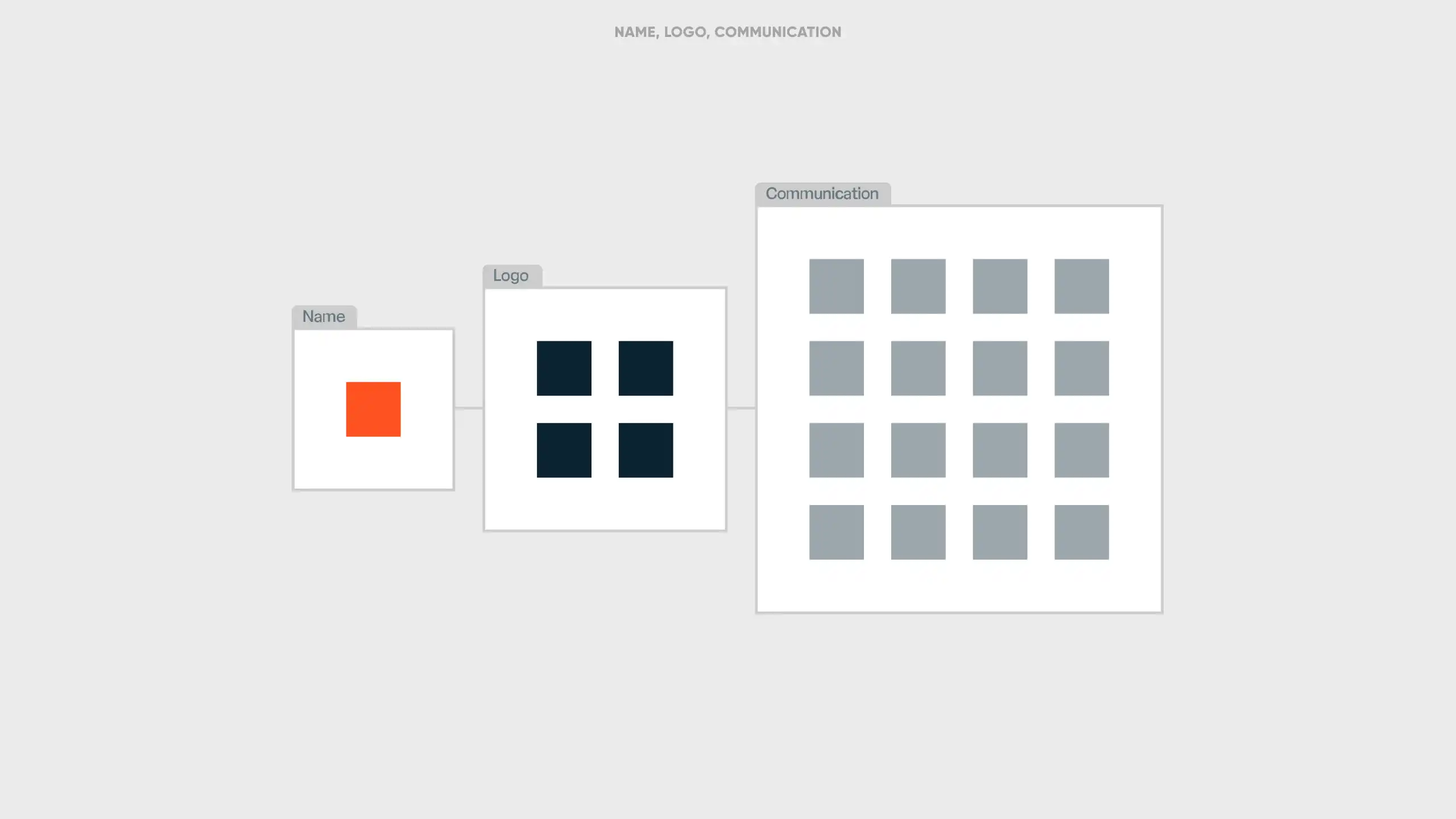
Three foundations, three speeds
Communication is the most mobile foundation. It covers the message, the tone, the campaigns and the way a company talks about itself day after day. It should, and must, evolve regularly to stay relevant.
A logo moves more slowly. It can shift with the times, but only in small, deliberate steps. When a logo is tweaked almost every year, that is rarely a sign of vitality. It is usually a sign that the brand itself is on its last legs.
A name is the slowest and most costly foundation to touch, not in media spend, but in risk: lost recognition, confused customers and years of accumulated memory that can disappear overnight. Changing a name is therefore the heaviest instrument available, and should only be used once the underlying reality itself has changed, or once the name itself has become so tainted that it stands in the way of recovery.
The fourth foundation: packaging
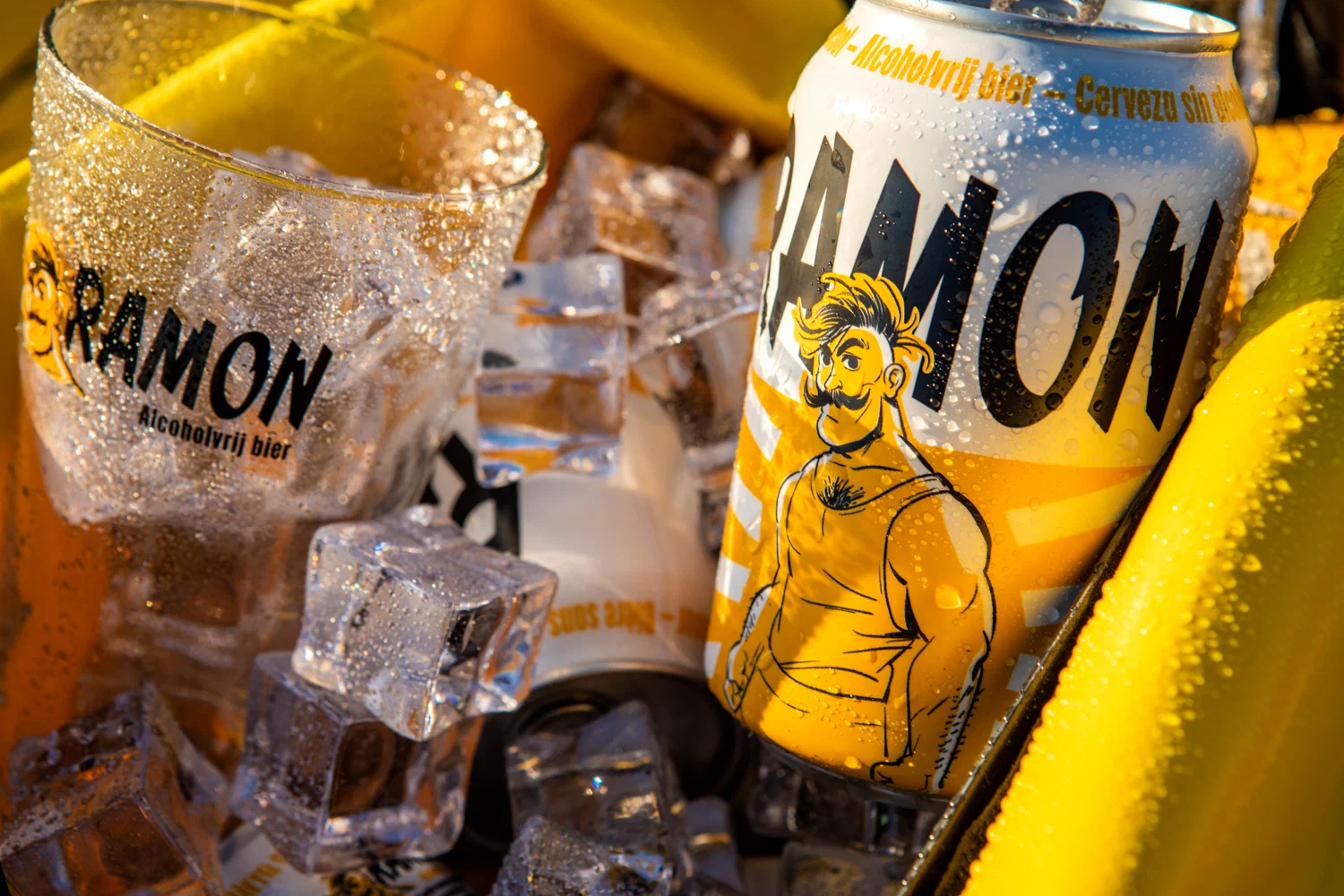
For companies with a physical product, a fourth foundation comes into play: packaging. This is the point where the brand literally ends up in the customer's hand, and where recognition often forms faster than through name or logo alone. A colour, a shape or a material can be a stronger memory trigger than the wordmark printed on it. That is exactly why packaging deserves the same caution as a logo: small adjustments can modernise a brand, while a full reset can wipe out years of built-up recognition in one move.

The invisible rebrand works best
Most successful brand evolutions stay under the radar. Philips is a good example. The company started in 1891 as a manufacturer of light bulbs, grew through consumer electronics, and has shifted entirely towards health technology in recent years. The name stayed, the logo evolved with the times, but the real change happened in communication: what the brand promised to be shifted repeatedly with the spirit of the times. Where Kodak stayed locked into the promise of film, Philips kept redefining its brand promise, without ever touching its name or logo.
Sometimes a small adjustment is enough
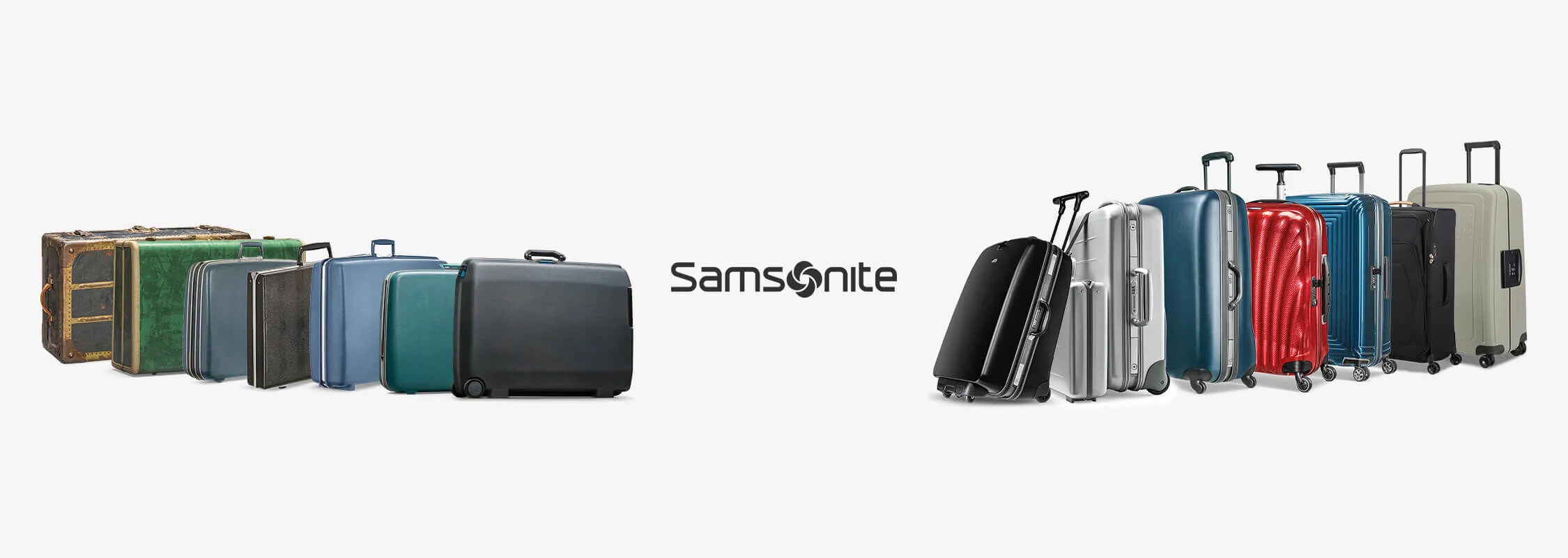
Not every change to a foundation has to be large. At Samsonite, only the logo was adjusted, replacing the letter "o" with the bagel emblem, while the name and the brand equity attached to it remained untouched. Remarkable acted as a sounding board for that graphic clarification.
That is exactly what Kapferer means by a successful revitalisation: build on the brand equity that already exists, and change no more than necessary.
So when should you actually change your name?
Changing a name is rarely a creative choice. At Fluxys, it was an organisational fact: when Distrigas split its two core activities into two separate companies in 2001, the new gas transport entity was given a new name because the underlying structure itself had changed, a process Remarkable guided from name creation through to launch.
At Belfius, the necessity lay elsewhere: when the Dexia holding ran into serious financial trouble at the end of 2011, the Belgian banking and insurance arm remained unaffected, but the confusion around the name still threatened to contaminate trust. No communication campaign could have fixed that. Only a new name could offer a credible fresh start. Remarkable guided the entire naming process, from more than 4,000 proposals to the final name, Belfius.
In both cases, the name change did not precede a problem. It was the answer to a structural or reputational reality that had already changed.
When companies change the wrong foundation
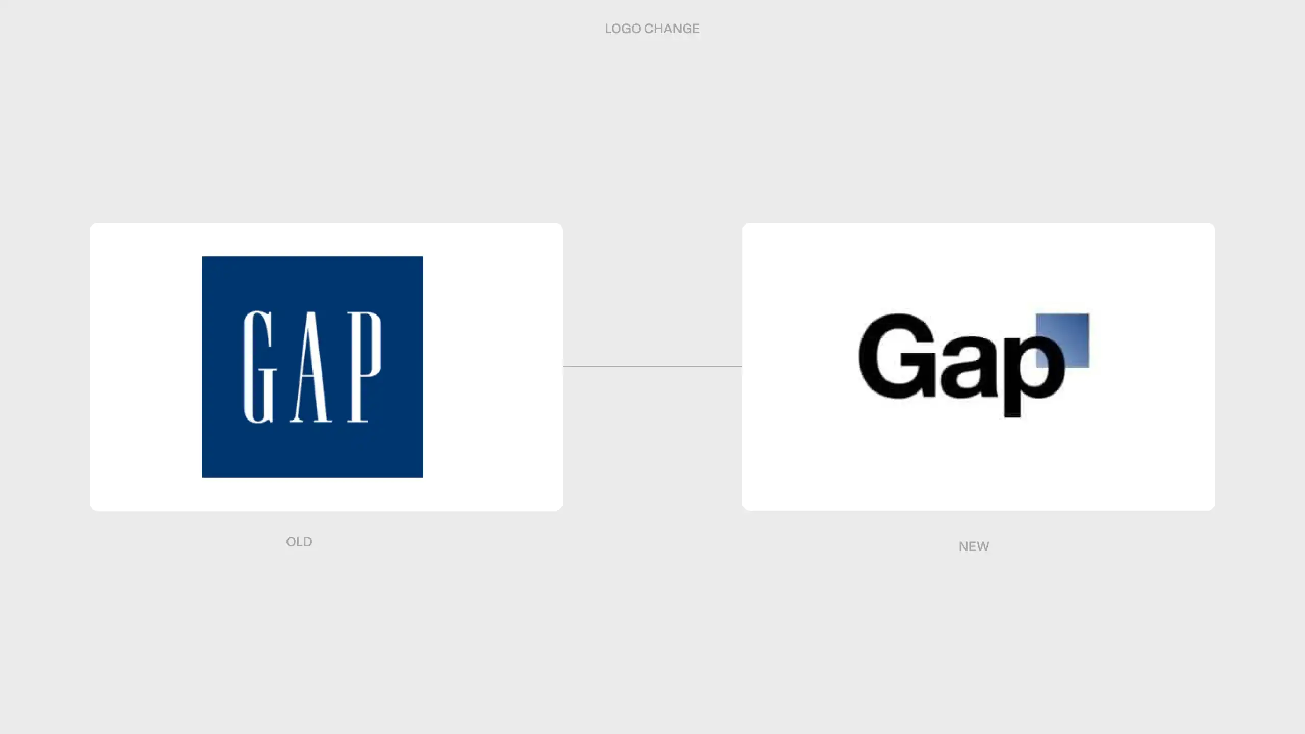
The most public rebranding failures are rarely design failures. They result from a foundation being touched when the underlying problem sat somewhere else. When Gap drastically changed its iconic logo in 2010 at an estimated cost of 100 million dollars, without a clear strategic rationale, it faced so much backlash within seven days that the company reinstated the old logo.
In our book Brand Change, we call this pattern the "shield effect": a new team takes charge, or marketing simply gets bored, and channels that restlessness into adjusting the brand mark, without the brand itself asking for it.
That is the core of the three brand foundations: not every brand decision carries the same weight, and the most expensive foundation of them all, the name, deserves the most restraint.