Are 3 stripes that distinctive?
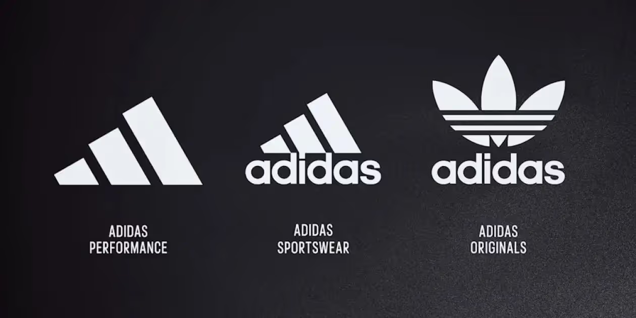

Will you spot the adidas emblem (without the wordmark) during the World Cup fixtures? After a similar evolution at Shell and Mastercard, adidas is also evolving to a simple emblem – because everyone recognises those stripes, right?
What if your Marketing team is too close to it? Then it’s best to go back to the essentials.
The 4 components of any Logo
Each logo consists of 4 components, a name, a typography, a color and a graphic element (emblem). Whenever possible show your full logo – and not just your emblem.
What Adidas is doing now during the World Cup with the launch of their “Performance” emblem, we call the Shell syndrome. This is where, as a Brand, you overestimate the value of your brand assets and fail to maximize or lose crucial touchpoints.
Just think about the consumer who doesn’t know your Brand (yet), or the new generation that has heard the word Adidas but won’t necessarily link it to 3 stripes yet.
Feel free to take the test and ask the kids tonight which brand this is, “impossible is nothing”?

A strong emblem
Other brands like Target and Apple did this earlier, but there you see what you describe. Then I hear you thinking, what about the Nike swoosh? Surely the shape of the swoosh compared to everyday shapes like 3 stripes (Adidas) or 2 circles (Mastercard) is quite unique.
Mastercard also didn’t really have a choice when considering whether or not to evolve to a mere emblem. According to Mastercard, they are anticipating digital payment options with this, by dropping the wordmark and focusing on the circles, the emblem. Real reason: focus away from the “card” in Mastercard, that way you can avoid – or delay – a name change?
The argument from the graphics angle to optimize the logo for digital applications may not outweigh strategic brand building at Adidas.

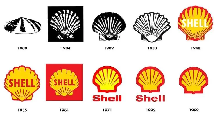
Where the name Shell comes from we’ll explain another time, the logo evolution we’ll give in advance.
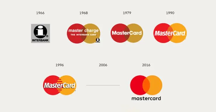
In the latest of the logo evolution at Mastercard, the wordmark is dropped.