A logo is not a marketing campaign


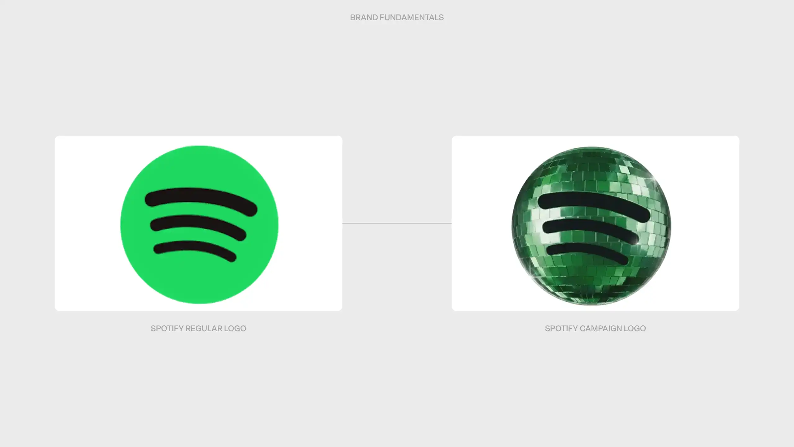
On 13 May 2026, Spotify replaced its iconic green circle with a glittering disco ball. Temporarily, for twenty days, to celebrate its twentieth anniversary. The reaction was immediate and unforgiving. A single post on X reached more than ten million views. People removed the app from their home screens. "Whoever designed this should be fired immediately."
Spotify had conceived a campaign. Users felt an attack on something they owned. That is not an exaggeration. That is precisely how brand equity works.
A temporary logo change does not exist for a strong brand
Spotify was clear in its communication: the new icon is temporary and campaign-driven. Yet the market reacted as though something permanent had been damaged. That disconnect between intention and reaction is not accidental.
A brand that has built scale over twenty years has done so through consistency. Every time someone opened the app, the green circle reinforced the same association: music, trust, recognition. That is not a conscious experience. It is a neurological pattern. When that pattern suddenly breaks, the brain responds with disorientation rather than delight. Several users genuinely thought the app was crashing. Others assumed something had gone wrong. The disco ball did not trigger the expected signal.
Brand equity is not only what a brand is worth. It is what a brand does inside the mind of a user: automatically, unconsciously, every single day.
Why users react so strongly to logo changes
The intensity of the reaction seems disproportionate at first glance. It is a temporary icon. But that surprise disappears once you understand what a logo actually is.
A logo is not an image. It is a memory anchor. It compresses years of experience, association and trust into a single visual signal. That works precisely as long as the signal stays stable. Spotify made only subtle adjustments to its green circle over more than a decade. In 2015, when the company slightly tweaked the shade of green, the backlash was already significant. That was then. Now, with more than 600 million users, the cost of any disruption is exponentially higher.
People are not saying "I find this aesthetically confusing." They are saying "change it back." That is not a style critique. It is an ownership response. A brand that becomes strong enough gradually stops being the exclusive property of the company that manages it. It becomes shared property of everyone who uses it daily.
The category error behind the disco ball
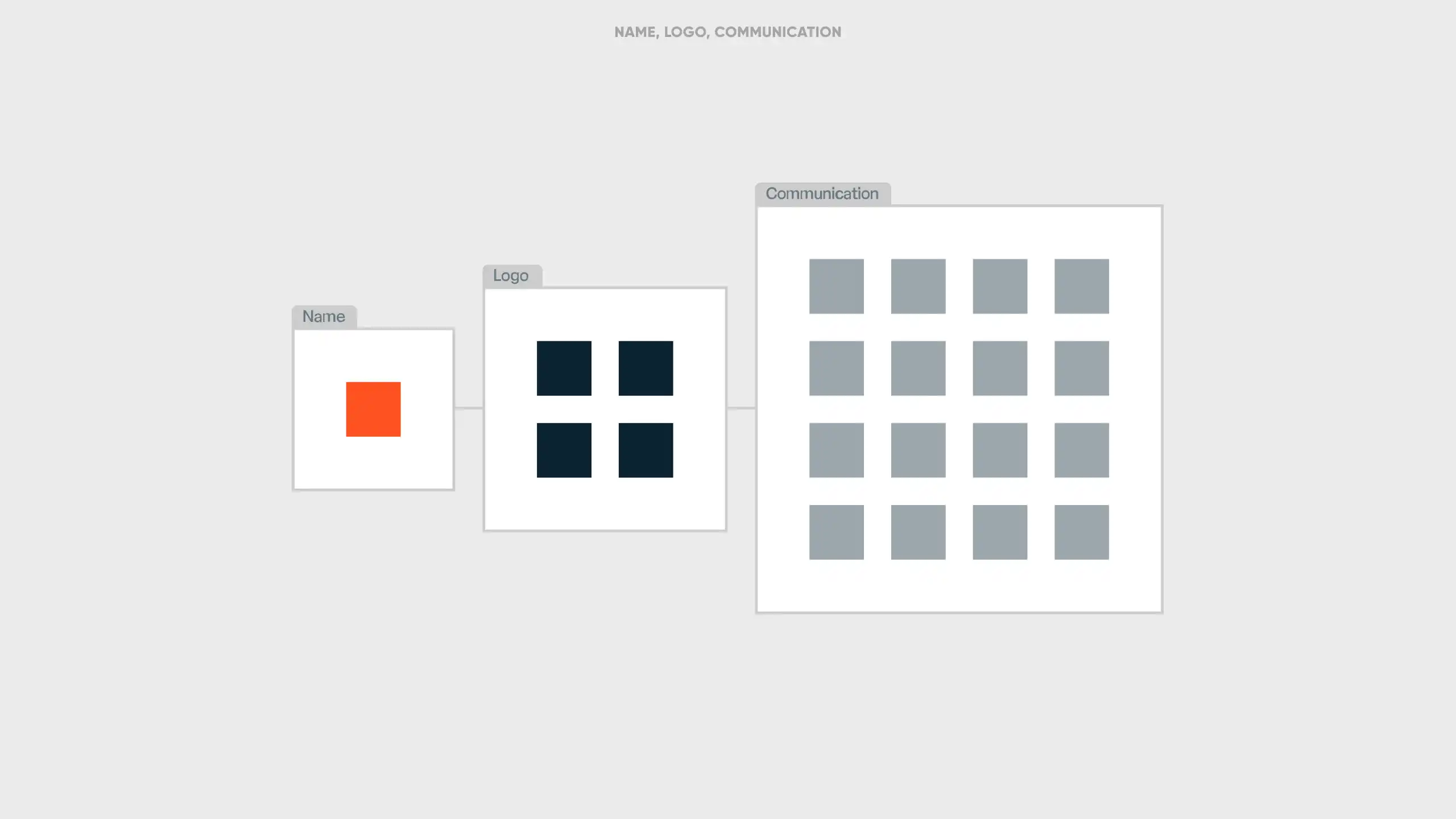
Spotify treated its logo as a communication tool, something to deploy, adapt and reset at will. But a logo is a brand fundamental. Not a communication choice.
The distinction is not subtle. Communication tools, slogans, campaign visuals, seasonal packaging, these are designed to vary. They carry a message. Brand fundamentals, name, logo, visual identity, colour, these carry recognition. They are not meant to say something. They are meant to always be there.
When a company confuses those two categories, it pays a price that is not immediately visible: the erosion of the automatic trust it has built. That erosion is temporary when the change is temporary. But the reflex to use brand fundamentals as a campaign element leaves traces that are harder to reverse.
When a brand fundamental does need to change
The fact that a logo should not be touched for a campaign does not mean brand fundamentals are untouchable. Sometimes they genuinely do need to change. But the threshold is high, and the reason must be structural.
"The last thing we do is change a brand name." That statement from Thierry Cattor, founder of Remarkable, captures the right attitude. Not because change is inherently wrong, but because its cost is too often underestimated.
The cases where adapting a brand fundamental is justified share one characteristic: the existing name or logo can no longer carry the new reality of the organisation. Dexia had to become Belfius not because the brand felt outdated, but because the name had become irreversibly tied to a crisis that had destroyed trust. The brand name had become a liability, not an anchor. Corona-Lotus had to evolve toward a name that could cross borders: Biscoff was born. Xandres, originally Andres, faced legal resistance in France and had no viable alternative.
What these cases share is that the trigger was external and/ or structural. Not a new marketing director looking to leave a mark. Not declining sales looking for a cosmetic fix. Not a campaign strategy in need of a refreshed icon. The organisation had fundamentally changed, or the name could no longer sustain growth across legal or linguistic boundaries.
The trap is a different kind of reasoning, one we encounter regularly in practice: an internal feeling that a brand "no longer feels fresh enough," or that a logo "deserves some renewal." Those are internal signals. Not strategic reasons. A brand change does not resolve a positioning problem. It relocates it.
The stronger the brand, the greater the strategic risk of any change
There is a paradox in brand management that few organisations articulate clearly. The brands that can change the least are often the brands that have been the most successful. Not because change is forbidden, but because its cost grows proportionally with the strength of the brand.
An unknown brand can update its logo without anyone noticing. A global brand with decades of consistency cannot. Every adjustment, however minor or temporary, collides with the conditioned expectations of millions of people simultaneously.
That insight has direct implications for how companies approach brand decisions. Rebranding, logo updates, name changes and visual refreshes are not creative or communication questions. They are strategic decisions where the relevant question is not "what do we want to communicate?" but "what equity are we putting at risk, and why?"
Answering that question requires a different framework than campaign thinking. It requires an understanding of how brand identity is built, how recognition functions, and what it costs to disrupt it, temporarily or permanently.
Spotify's disco ball will disappear. The green circle will return. The outrage will fade.
But the question this episode raises remains relevant for any company with a strong brand: at what point does a visual element stop being a design choice and become a strategic asset? And who in the organisation is responsible for protecting that distinction?
A brand is only durably strong when the people managing it understand exactly what they are holding.