Nokia’s new tone

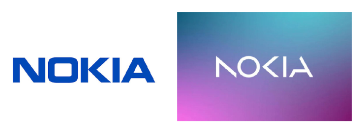
For the first time in 60 years, Nokia is changing its iconic logo. Before the start of the Mobile World Congress in Barcelona, the company revealed a new brand identity, and it’s a big change. The company opted for a more modern and digitalized logo. And just like that, the iconic ‘Yale Bleu’ font became history.
Networking & industrial digitalisation
With their new brand identity, the company wants to be less associated with mobile phones. They are focusing on networks and industrial digitalisation, something completely different from old mobiles according to Lundmark, CEO of NOKIA.
The company doesn’t even make mobiles and smartphones anymore, Nokia phones have been marketed by the Finnish company, HMD Global, since 2016. From 1989 to 2008, Nokia was the world’s biggest phone brand, but after the arrival of IOS and Android, the company could not maintain that position.
The new NOKIA logo
If we analyse a brand and check if the logo is still relevant, we can divide the logo into 4 elements, namely;
Name; The most important thing that NOKIA saved, is their name. “The last thing we do, is changing the brand name” is a quote in the Remarkable Weekly Calendar for a good reason.
The name NOKIA comes from the Finnish town in which NOKIA was founded in 1865 by Frederik Idestam.
Typography; The new NOKIA logo features a brand new typography. They changed the previously robust typeface to a rather modern & digital font that reflects their new brand strategy.
Colour; The familiar Nokia blue, makes place for a range of colours that vary depending on the context. For example, the blue colour is associated with innovation, technology & progress. While the pink colour stands for humanity, emotion & creativity.
Symbol; The symbol is mostly unchanged, consisting of the brand name in the new chosen font.
Brand changes
It often happens that people feel the need to change the logo, although this should always arise from a need of the brand itself. It is normal for a logo to keep up with the times and occasionally take a different look.
Look at the automotive sector. A lot of car brands, including Citroën, have already implemented a logo & brand identity change. The Stellantis group gave an update to their French brands Peugeot and Renault. FIAT and Opel were also facing changes. Other (luxury) car brands such as Bugatti, Aston Martin and DACIA are showing the 2D evolution as well, as Volkswagen announced at the 2019 Frankfurt Motor Show.

Natural evolution
Besides that almost natural evolution in the BrandLifeCycle of almost any brand, it is important to ensure that the logo evolves and doesn’t abruptly change its shape. The correct transfer and transition of the still valuable elements from the built-up brand equity should always dominate.
Before changing the brand, we should always consider the established values, current strength and future potential of the existing brands. Companies were used to have the same logo for 25 to 100 years, today logos last a maximum of 15 years. Think of major Belgian telecom companies such as Proximus & Telenet, which came out with a new variant barely 10 years after launching their logo.